chorus wuwrc
!['Untitled-1.psd' failed to upload. TransportError: Error code = 7, Path = /_/BloggerUi/data/batchexecute, Message = There was an error during the transport or processing of this request., Unknown HTTP error in underlying XHR (HTTP Status: 0) (XHR Error Code: 6) (XHR Error Message: ' [0]')](https://www.blogger.com/img/transparent.gif)
the choices i am thinking about are:
MAGAZIINES
FILM MARKETING
do now
film cover
§
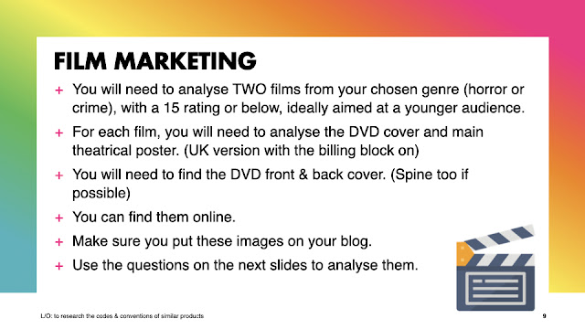
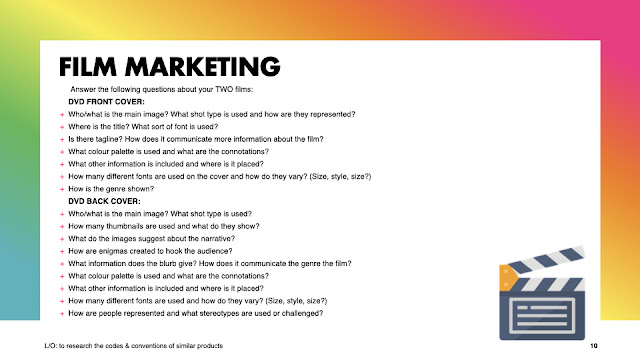
- its a car called lightening McQueen, presented as a protagonist wide shot
- see everyone above logo
- disney logo,pixar,carslogo script
- bottom cars font
- probably on the back
- red and silver colour pallet has pretty rich connotations
- 3 different fonts there all different you have serif,script and whatever disney is
- family genre conventions due to the fact its animated and there is 0 violence
- (i didn't know)
- there all pretty happy and look like there having a good time
- the target audience is childeren and people interested in cars
- the main 2 characters are the main image - wide shot. type - reprresented as mischevious and clumsy
- protagonists in the front and the antagonist as a shadow in the back ground
- dream works logo on the bottom right hand corner
- up the top it is in a sans serif font
- the edition up the top - some extra info on the bottom - the age range- and a puff
- yellow and red colour pallet connotes Rupert bear
- all one font
- family / horror
- (i don't know)
- represented as nice ad scared people at the same time
- the target audience is targeted at children and fans of the franchise
Wednesday 8th May 2024
DO NOW
1.
2. death, blood, SCREAMS OF INNOCENT
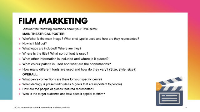
film marketing questions :
Movie #1
front cover
1. the main image of my 1st film cover is a disfigured face in front of a solemn house , the shot type used in this film cover is a wide shot type and the person is represented as a terrifying figure.
2. the title "missing" is at the top of the front cover it uses a serif font which is usually used for horror as it has sharp ends , i will use this for my title.
3. the tagline of "missing" is "based on a true story" the front cover also uses a serif font on the tagline to match with the title of the film.
4. the colour pallet of this film is a bronze and black colour , this is quite normal for a horror movie as darkness connotes suspense which is typical in a horror movie as-well.
5. additional information included on the front cover is a rating / review located on the top right hand side underneath the title there is also an age rating right in the bottom hand corner and finally there is information about who created and designed the film on the bottom middle.
6. there are a total of 2 fonts on the front cover and they vary from blocky fonts contrasting to very fine serif fonts they are all different sized the title being the biggest.
7. the genre is shown by portraying a scary front image with sharp daggering fonts to produce imagery , furthermore horror fans may know the producers on the front cover and will be able to see the genre
back cover
1 . the main image of my back cover is a kid with a flashlight, it consists of a close up shot
2. there are 4 different thumb nails shown all presenting scary things such as:
. kid with flashlight
. child on swing
. hand on window
. a doll or something
3. the images suggest that the narrative is a terrifying freaky narrative
4. a few enigmas created to hook the audience are :
. what is the guy with the flashlight looking at
. who is the kid on the swing
. why is the guy in the window screaming
5. i cant read the blurb however a blurb summarises the story into a paragraph
6. the colour pallet used on the back cover is a red , beige and black colour pallet which connotes a haunting and eery theme.
7. other things on the back are :
barcodes- where u scan the DVD to buy
credit blocks- information the credit block gives is the actors , creators , other included people some people could be famous for horror movies which would help horror movie fans notice and realise the genre of this film.
age rating - an age rating shows the age range of pupil who can view the movie or " Entsetzen film " (German for horror film )
8. there are 4 different fonts on the back cover and they vary from fine serif fonts with ticks all the way to blocky fonts all pretty much the same size to be fare except for the blurb.
9. the various characters in the back cover can be seen represented as either absolutely terrifying or curious and wanting to venture further
some stereotypes/challenging stereotypes could be (ask miss mac for help you have 0 clue)
Movie #2
front cover
1. the main image consists of the ghost mask behind the main cast in a close up shot and they are represented as brave.
2. the title of the film is at the bottom of the front cover the font used is a sans serif font which is a blocky font
3. the tagline of this movie is "be aware of the rules" it communicates with the film because its a threat
4. the colour pallet of this movie is red black white the connotations of this is that its scary because the unknown is scary and then red is like blood
5. other information on the front cover is :
- age rating
- creators of the film
- the edition of the film
- the sequel or prequel edition (idk how to say it)
the other information is scattered around the edges and not in the middle of the front cover
6. there are 4 different fonts all in different sizes and shapes
7. the genre of this film can clearly be seen where the serious facial expressions on the main characters of the front cover and the sinister mask in the background
back cover
1. the main image is a white horror mask facing towards another red horror mask on a plain black canvas
2. there are a total of 4 thumb nails consisting of:
- some one standing behind someone else creepy like
- looks like 3 people walking
- smth to do woman
3. a pretty slow chill film but also also its pretty scary you know
4. who's behind the mask , bane ?
5. i cant read the blurb its a bit blurby
6. the colour pallet is black, red, and white it connotes danger and darkness
7. age ratings
barcodes
producers
actors
designers
various fellow companies
8. there are 8 different fonts all in different sizes
9. the people on the back are represented as brave and courageouos as there are some scare people who are represented as frightening an not nice people me personally i wouldn't wanna be around em.
1. on movie #1 the main image is a house with a translucent mummy on top of it
in movie # 2 the main image is a mask with the main stood in front lookin pretty gusty
2. 1 movie number 1 its all around the outside leting us see the main image in all of its glory
in movie 2 everything is also around the outside providing a clear and elegant gaze upon the award winning winning front cover it is
3. the dvd symbol on da back , the movies iconic logos
age rating symbol and a weird symbol idk
4. inn the 1st film the its at the top of the film cover
in the second film its at the bottom of the film cover some pretty cool fonts
5. in both films there are :
credit blocks
blurbs
age ratings
barcodes
film production and other connected companies
6. the colour pallets used in my 2 film being used covers are are black red and gray the conotations of these is darkness depression and death red can also connote anger and blood
7. the different fonts used in my 2 film covers are sans/slab and serif they are small big and medium
8. From classic monster tales like Dracula to modern blood-soaked thrillers and urban horror, many elements make up the horror genre. Some recurring themes in horror stories include the concept of the fear of the unknown, isolation and alienation, loss and grief, and basic human fears such as death and mortality
9. the ideology of horror movies is things such as the friends u make along the way or family
10. the people in the places are seen as scary or scared.
11. the target audience is 15 year olds or people who are horror fans or maybe even fans of the actor or film production companies .
1. i would expect to see a scary image in the imagery of a horror film cover
2. the colour pallet i am expect to see a dark colour pallet and hints of blood to how murder
3. i would expect little typography as the real fear in horrors is fear of the unknown
4. i would expect a typical character to be this 1 annoying girl who screams really loud and is really annoying like Ethan
5. group goes to forest 1 dies its pretty funny they solve the murder and escape
6.all of the characters are traditionally showed scared however there is 1 who's like really cocky then dies 1st
TASK 3
1. 3 adjectives to describe the representationes of my genre are:
- bold
- terrified
- petrified
2. the women have been presented as scared in both these covers this has been constructed as like in most horror movies the girl is shown screaming and scared
3. i cant see any representations of age in the 2 covers apart from the fact there all stereotypically grown up and mature
4.in both covers there are all white people in the covers apart from the mask who we can not tell the ethnicity of this character
5. horror and crime is represented in both the covers by the fear and blood showed in the covers
6.In the 2 film covers they both repeatedly use the stereotype of women being frail and scared of everything .
TASK 4 part 1
scream 4
age range for this movie is intended for 15 - 25
missing
age range for this movie is also 15-25(it also said 14 but that didn't make sense too me)
TASK 4 PART 2
do now
1, what is ur fav horror colour pallet?
2, what do you think the stereotypes should be in a horror film?
3, what kind of features make a horror film stand out to you?
do now
1, 1955
2, major quality , miss sweetly
3, working class
4, mise en scene , typography , colour pallet
5, stereotypes, patreharical , age
do now
1,A🥇
2, sweating like a pig feeling like a fox🥈
3, system of ideas and ideals 🥉
4, referencing different texts inside of a text 🏅
5, 12🎖️
do now
1, font correct
2, 8th October 2021 correct
3, action x martial arts
4, linking to other texts or films through your own text or film coorect
5, strong
lo: :to research genre codes and conventions
do now
1, horror
2, facial expression and colour pallet
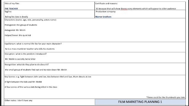
3, stereo type i challenge is to have a very elderly bedridden dying man (mr welsh) to be shown as strong and independant
Do now
the representation of something is how its seen.
The types of media representations are based on social indicators such as:
- Age.
- Gender.
- Sexuality.
- Ethnicity.
- Social class.
- Disability.
Do Now
A primary source gives you direct access to the subject of your research. Secondary sources provide second-hand information and commentary from other researchers. Examples include journal articles, reviews, and academic books. A secondary source describes, interprets, or synthesises primary sources.
RESEARCH CONCLUSION
i have chosen horror genre people think there cool watching horror especially ages 16-24
my target audience is people interested in horror and men 16-24 year olds
possible names for my film may be welsh, the teacher, the class
(these will appear to the target audience because of the enigma)
a summary of my film is - evil science teacher murders his students for lack of homework people can relate which will appeal to a target audience
a few taglines i could use are :
. failing his class is deadly
. you dont want a detention. do you?
. you wont make it to detention
i would like mr welsh in a threatening pose on a black canvas or a un focussed classroom with blood dripping from the title
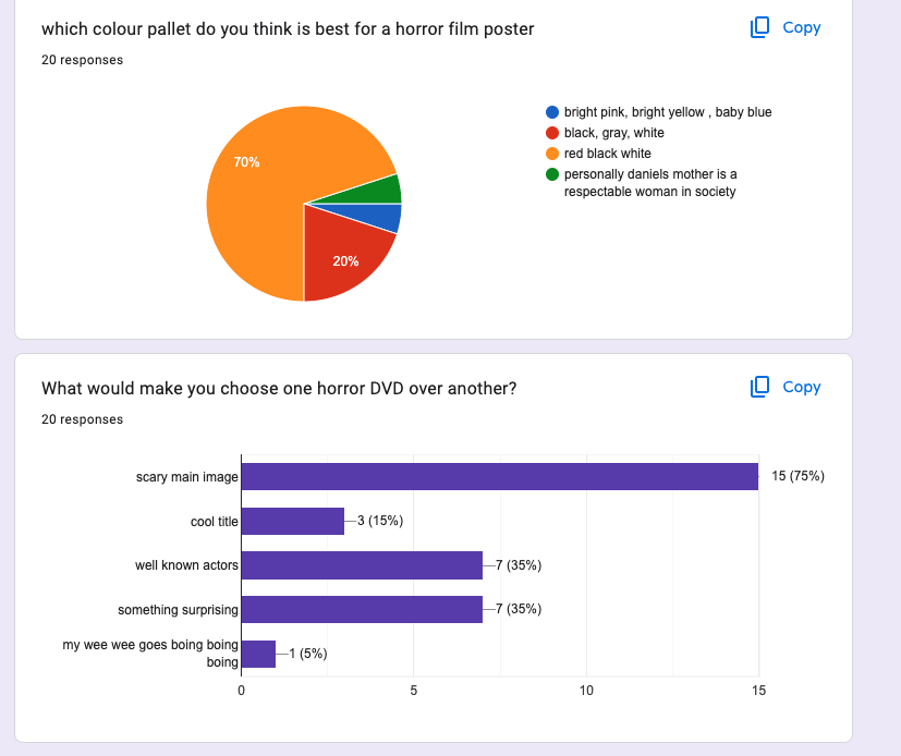
i am thinking of using black white and red title as these were the highest colours from my research
i would like my main image as mr welsh
the information i will include on my poster wil be :
credit block
tagline
title
creators
logo
elicit a sense of dread in the reader through frightening images, themes, and situations. In the horror genre, story and characters are just as important as mood and atmosphere.
i would like a dead child in the back ground and another dead child and a final dead child all dead in different ways
the credit block and creators of this will. be included in information on my film poster
i will have the title an age range and a logo on the spine of my dvd
the way they are linked is by the same person as the main image and the title
i will use a heavy serif font and script writing for the credit block
the representations of my film will be scary and funny
the stereo types i will use and challenge are old people being frail .
the stereo type i will support is old people being scary
do now
demographics = facts
psychographics = attributes cant be proven
target audience
l/o:
to research our target audience to enable successful targettting
HEY DANNY BOY LEFT YOUR BLOGGER OPEN
CAUGHT YOU LACKING BIG BOY
ADDED A NEW POTATO FOR YOU
YOUR WELCOME
DONT LET ME CATCH YOU LACKING AGAIN LIL BRO
corse work review & plan of attack
13th sep-film poster stuff.
do now
1, roger moore
2, 1974
do now
1, bbfc
2, 12=have to be 12 years old 12a is only for films and can be younger if acompanied
3, distribution
4, distribution
5, covid
do now
1 16-24 year olds who enjoy horror films
2 a horror movie front cover back cover poster and spine
3 enigma, something relatable such as a class room environment,
4
5






RESEARCH
ReplyDeleteANALYSIS: great analysis of the DVD covers but where is the analysis of the two posters?
CODES & CONVENTIONS: good but a bit brief. More details would be better.
REPRESENTATIONS: also good. Make sure you try to use these in your own product.
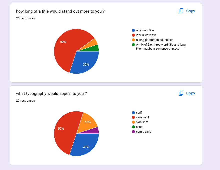
AUDIENCE RESEARCH: add a screen shot of your questionnaire and then the results.